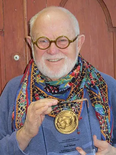
Tomie dePaola – American illustrator and author 1934-2020
When I was a student at Pratt in the 1950s, studying illustration, I remember a fellow student asking one of our instructors, “When do we learn about style?” “We won’t learn about style,” he replied. “Style happens naturally. If you keep on working, eventually the way you can and want to express yourself will surface. Meanwhile, do the assignments, listen to the critiques, don’t miss your drawing classes, painting classes, design classes and, by all means, look at everything. Go to the galleries and the museums. Your own style will surface.”
Another instructor, the wonderful Richard Lindner, told us, “Observe. Observe everything around you. Observe what you are interested in. Observe what kind of objects you surround yourself with. That will give you the clue to your own vision.” During the summer of 1955,1 was studying at Skowhegan School of Painting and Sculpture in Maine. I was fortunate enough to work with Ben Shahn, who was an idol of mine. The wise words from this great man were similar. Style evolves. He also spoke to me at length about “the shape of content.” It was Shahn’s thought that “a point of view conditions the paint surface which the artist creates.”
So, being a “good student,” 1 listened to my mentors. I noticed how my devotion changed from Jon Whitcomb, who did “pretty girl” illustrations, to Shahn, Picasso, Bonnard, and Rouault. How the “candy box” religious art from my Catholic boyhood was replaced by Cimabue, Fra Angelico, Giotto, and Botticelli and all those Unknown sculptors and fresco painters of the Romanesque period. How over the years my love of folk art from all cultures became and still is close to obsessive.
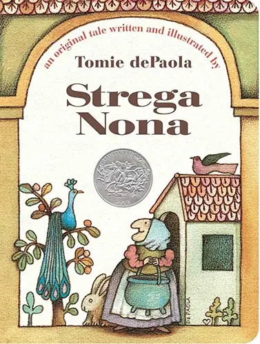
All these things added up and my style began to emerge. And it hasn’t really changed in over thirty-five years. The roots are there in my early pasta all over an Italian village square when Big Anthony fails to master Strega Nona’s magic. DePaola has always been completely at ease with folktales, whether it is Fin M’Coul: The Giant of Knockmany Hill (1981) from Ireland, The Legend of the Bluebonnet (1983) from the Comanche of Texas, or his many Italian stories.
He has written several autobiographical stories in which he has shared childhood experiences that are sometimes amusing, as in Watch Out for the Chicken Feet in Your Soup (1974), but more often deeply personal and serious, as in Nana Upstairs and Nana Downstairs (1973). The poignancy of these books is also present in his series of religious stories. The Clown of God (1978) and Francis, the Poor Man of Assisi (1990) have formal compositions and serious-faced characters reminiscent of medieval Italian church paintings.
Tomie DePaola began a series of anthologies in 1985 with Tomie dePaola’s Mother Goose, an exuberant, brightly illustrated book that has become one of the standards of the genre. It was followed by collections of nursery tales, poems, Bible stories, and Christmas carols. In addition to his own books, he has illustrated many works by other writers, most notably Tony Johnston (The Quilt Story, 1985) and Jean Fritz (Shh! We’re Writing the Constitution, 1987). Recently, he broke out of his simple picture book mold with Bonjour, Mr. Satie (1991), a spoof of Gertrude Stein’s literary salon. It received mixed reviews, and its visual jokes appealed mainly to dePaola’s adult audience.
Tomie DePaola has garnered many awards from children’s literature professionals during his career: he received a Caldecott Honor Award in 1976 for Strega Nona, the Kerlan Award of the University of Minnesota in 1981, the Regina Medal by the Catholic Library Association in 1983, and in 1990, he was the United States nominee for the Hans Christian Andersen Award for illustration. In 1999 Barbara Elleman chronicled his life in Tomie dePaola: His Art and Story. Tomie dePaola’s popularity and volume of work assure him prominence in the world of children’s books. The variety, wit, and child appeal of his books should make a lasting contribution to the field.
Tomie dePaola in his own words …
When I was a student at Pratt in the 1950s, studying illustration, I remember a fellow student asking one of our instructors, “When do we learn about style?” “We won’t learn about style,” he replied. “Style happens naturally. If you keep on working, eventually the way you can and want to express yourself will surface. Meanwhile, do the assignments, listen to the critiques, don’t miss your drawing classes, painting classes, design classes and, by all means, look at everything. Go to the galleries and the museums. Your own style will surface.”
Another instructor, the wonderful Richard Lindner, told us, “Observe. Observe everything around you. Observe what you are interested in. Observe what kind of objects you surround yourself with. That will give you the clue to your own vision.” During the summer of 1955,1 was studying at Skowhegan School of Painting and Sculpture in Maine. I was fortunate enough to work with Ben Shahn, who was an idol of mine. The wise words from this great man were similar. Style evolves. He also spoke to me at length about “the shape of content.” It was Shahn’s thought that “a point of view conditions the paint surface which the artist creates.”
So, being a “good student,” I listened to my mentors. I noticed how my devotion changed from Jon Whitcomb, who did “pretty girl” illustrations, to Shahn, Picasso, Bonnard, and Rouault. How the “candy box” religious art from my Catholic boyhood was replaced by Cimabue, Fra Angelico, Giotto, and Botticelli and all those Unknown sculptors and fresco painters of the Romanesque period. How over the years my love of folk art from all cultures became and still is close to obsessive.
All these things added up and my style began to emerge. And it hasn’t really changed in over thirty-five years. The roots are there in my early drawings and paintings — things done way before I began illustrating books. There are white birds, pink tiled roofs, arched doors and windows. My early love of line and strong design and stylization has grown and been refined over the years, but the seeds are all there in the early work.
My work is recognizable. I’ve chosen to follow my own vision rather than switch around and try what is fashionable or “au courant.” It thrills and pleases me when teachers, parents, and librarians tell me that young children know when they are looking at one of my books or a piece of my art. My style is purely an outward expression of my own inner vision, further determined in its nuances by the content of the piece being visualized.
At Pratt Institute, students were also exposed to a myriad of technical skills — representational drawing, rendering, perspective, stylized drawing, use of nonrepresentational color, various painting techniques — and mediums. Success was measured by how well one could use the various techniques and skills when called upon. But, finally in junior and senior year, favorite mediums and favorite ways of applying them became very individual and personal. Even to this day, I can do a photographic rendering if I have to. (I’d rather give up popcorn or use a camera.) Those skills and techniques are just that — methods to be called upon when needed. My preference is for strong line and design, using the medium and technique appropriate to the piece.
I personally use one of several techniques for my work. The first is very straightforward — a dark brown line with the color applied within the line. For this, I use Rotring Artists Colors, which is a liquid transparent acrylic paint. I use it because it is color-fast and permanent and totally intermixable. It reduces with water and is waterproof when dry, so I can build up thin “skins” of color. The Art Lesson was done in this technique.
The second technique is more painterly. I use acrylic paints opaquely. I lay down a base color, usually a golden shade. Next, I do a line drawing, again with a dark brown line. Then, I begin painting, building up layer after layer. Bonjour, Mr. Satie is a good example of this technique.
The third technique I employ is a combination of the two — both transparent and opaque, with the occasional use of colored pencils as well. I used this technique in Hark!
Unfortunately, technique can mask bad composition and bad drawing. Flashy, rendered photographic art can overwhelm the untrained eye so that mediocre expression gets undeserved attention. The personal expression that style hinges on is just that — personal. And after thirty years of illustrating books, I’d need several volumes to pass on all that I think about when I create my books.
J.S.
Source: Children’s Books and their Creators, Anita Silvey.