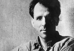
Barry Moser – American illustrator and designer, b. 1940
American illustrator and designer, b. 1940. The first books Barry Moser illustrated were literary classics, mostly for adults, such as Moby-Dick, issued in a limited edition by a small press. Since the 1980s, he has also applied his artistry to the field of books for children.
Born in Chattanooga, Tennessee, Barry Moser was raised in a loving environment and introduced to diverse cultural experiences such as Italian opera, musical comedy, and the music of Fats Waller. But he also recalls that he was “taught to be a racist, to be anti-Catholic, anti-Semitic, and xenophobic.” He hated school, but had a talent for drawing, which was encouraged, and he benefited from the direction of an uncle who had a woodworking shop and worked with him there, giving him a drawing table.
At age twelve, Moser was sent to military school; in 1958 he attended Auburn University and had his first instruction in drawing and design. He then attended and graduated from the University of Chattanooga as a painting major in 1962. He found a mentor there who led him to study the works of Paul Cezanne, Georges Braque, and Shahn, among others. After teaching in Tennessee, he and his family moved to Williston Academy in Easthampton, Massachusetts. For fifteen years, he taught himself the skills of making etchings and wood engravings, working with type, life drawing, art history, book design, and calligraphy.
In 1969 Barry Moser met Leonard Baskin, who helped him improve his drawing and also made an introduction to a pressman who taught Moser how to improve his skills in printing wood engravings. He designed and printed his first book in 1969. Since then, Moser has illustrated more than 120 books, and his work is represented in many museums and collections, such as the Library of Congress, Harvard University, the London College of Printing, the British Museum, and Cambridge University.
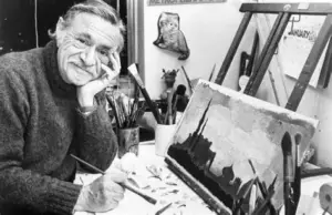
Barry Moser in his own words …
I made my first book in 1969, a slender little presentation of an essay by the American painter James Abbott McNeill Whistler called The Red Rag. I made it by hand. I set the type. I ran the printing press. I folded and gathered the sheets. Since that modest beginning, I have in one way or another been involved in making around 150 books. There is a botanical treatise in the stacks called The Flowering Plants of Massachusetts and another called The Adventurous Gardner. There is Herman Melville’s Moby-Dick and Dante’s Divine Comedy. Virgil’s Aeneid and Homer’s Odyssey.
If there is one thing I have learned from these books and the years it has taken me to do them, it is that illustrations by themselves do not make handsome books. Handsome books are the result of harmony—the arranging and combining of all the various graphic elements in pleasant and interesting ways that ultimately form a whole. The books I make for children, like the books I make for adults, are all done for the same purpose—to make a beautiful book.
I begin my work, of course, by reading the text. Several times. I am mindful not only of narrative content, place, and characters but also of the mood, scope, and timbre of the text. Mood, scope, and timbre tell me how big a book should be, how generous its margins should be, what typeface and leading it wants, where its folios should go, what kind of imagery is appropriate, and even how many pictures there should be. These are subjective choices to be sure, choices that are determined by the prejudices of taste. For example, I never use sans serif typefaces; I prefer wide margins so that hands and fingers never cover up type; I eschew all decoration except calligraphic embellishments; and for pictures I prefer simple compositions that focus on character, setting, or objects.
It might seem from what I have just said that I subordinate illustrations. I do not. Making pictures for books is important to me but only in that it contributes to the overall beauty of the book. I see illustration as equal to, not superior to, text, typography, and overall design.
As for my illustrations, or “pictures” as I prefer to call them, they are rarely based on fantasy or flights I of imagination. I base my images on facts and on things observed. I find that nature and the world I around me create and suggest things stranger and more wonderful than things my mind and eye invent.
To this end I have built an extensive library and a bulging scrap file from which I borrow and steal freely, being, as I am, unconcerned about originality. I think of myself, as Christopher Hogwood said about George Frideric Handel, as an artist who polishes other men’s stones into jewels—a bricoleur, if you will, a user of discarded things.
Originality is a result, not a task. Originality cannot be sought. Seeking to be original is like staring at a star—it disappears just when you think you’ve got it. Further, history teaches us that all things have antecedents and that only time and history itself can fairly judge what has been original and what has not.
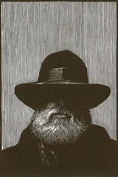
As for media, I prefer the demanding and unforgiving: wood engraving and transparent watercolor. The Red Rag was illustrated with a portrait of Whistler drawn on scratchboard and reproduced to look like a wood engraving. Wood engraving is a relief printmaking technique invented in the eighteenth century specifically for book illustration, and it took me years to master that which I could only at first slavishly imitate. Wood engraving is by its nature dark. It is demanding and unforgiving because errors cannot be repaired except through virtuoso games of hide-and-seek.
The influence of wood engraving on my watercolor painting is, to me, apparent. First, my watercolors employ a dark palette that is not typical of the medium; second, the paintings have specific and definite edges; and third, the paintings reflect my sense of chiaroscuro that was inculcated through printmaking. If my work as an artiste de livre is successful, my books will not only have striking and provocative images but a sense of harmony, wholeness, and inevitability—a sense of “Of course, how could it be any other way?”
His powerful watercolors for Dante’s The Divine Comedy (1980) are typical of his style. In black-and-white wash, he delineates the gnarled roots of a tree and so mimics the tangled veins and blood vessels imposed on the bodies of tortured souls. His use of light and dark shading is dramatic and powerful, and his exquisite calligraphy is an instantly identifiable aspect of his books.
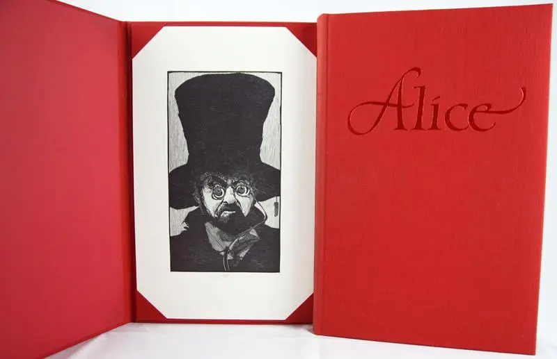
In 1982 his illustrations for Lewis Carroll’s Alice’s Adventures in Wonderland were published. The book won an American Book Award for pictorial design. Barry Moser illustrated classic Joel Chandler Harris tales, adapted by Van Dyke Parks and Malcolm Jones, in Jump!: The Adventures of Brer Rabbit (1986).
Another example of his fine work in books for children is In the Beginning: Creation Stories from around the World (1988), retold by Virginia Hamilton, which was named a Newbery Honor Book by the American Library Association. Because Moser has applied his distinctive style, coupled with his trademark calligraphy, to a great number of works of classic literature for adults and for children, he has distinguished himself as a major American book illustrator.
S.H.H.
Source: Children’s Books and their Creators, Anita Silvey.