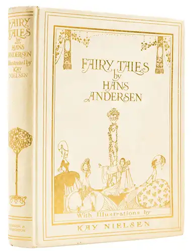
In the pantheon of illustrated children’s books, certain collaborations achieve an almost mythical status, where the vision of author and artist becomes so entwined they seem to create a single, seamless world. The 1924 edition of Fairy Tales by Hans Christian Andersen, illustrated by the Danish artist Kay Nielsen, stands as a supreme example of this rare alchemy. It is a work that does not merely accompany Andersen’s text but elevates it, translating the stories’ profound blend of melancholy, beauty, and wonder into a visual language of exquisite refinement.
The book arrived at a pivotal moment in Nielsen’s career. A Dane working in London, he had already established himself as a luminary of the “Golden Age” of illustration, alongside figures like Arthur Rackham and Edmund Dulac, with celebrated works such as In Powder and Crinoline (1913) and East of the Sun, West of the Moon (1914). His approach to Andersen, a fellow countryman, was deeply personal. Reports indicate that he had been working on these interpretations since his student days in Paris, suggesting a long-held ambition to visualize the stories that had shaped his own cultural consciousness . Published by Hodder & Stoughton, the volume was initially released in a lavish, limited edition of 500 numbered copies, each signed by the artist, a testament to the high regard for his craft.
To open this book is to enter a universe defined by Nielsen’s unmistakable aesthetic. The most celebrated feature of his work here is the series of twelve color plates, each one a masterclass in mood and composition. These are not simply illustrations; they are jewel-like watercolors, mounted onto the heavy pages and often protected by captioned tissue guards . One can see the evolution of Nielsen’s style in these images. He masterfully synthesizes the decorative elegance of Art Nouveau with the bold, geometric forms and flattened perspectives that hint at the burgeoning Art Deco movement.
The palette is often ethereal, dominated by watery blues, soft golds, and muted earth tones, creating a sense of dreamlike otherworldliness . Yet, this delicacy is counterbalanced by a powerful sense of stylization. His figures are instantly recognizable: princes and princesses stand with an impossibly graceful, elongated grace; their garments billow in gravity-defying curves that owe as much to Persian miniatures as they do to contemporary European art. This flattening of form, this rejection of strict realism, allows Nielsen to focus on the emotional and symbolic core of each scene, distilling a story’s essence into a single, resonant image.
Nielsen’s genius, however, extends far beyond these full-page plates. The entire volume is conceived as a unified work of art. Each page is framed within delicate, intricate borders, often composed of motifs and vignettes that subtly foreshadow the narrative’s themes . Scattered throughout the text are numerous black-and-white illustrations—some full-page, others smaller head- or tail-pieces—that act as quiet visual echoes, sustaining the magical atmosphere from cover to cover. This total design approach creates an immersive reading experience, where the boundary between word and image feels wonderfully porous.
The choice of tales included in this edition aligns perfectly with Nielsen’s artistic sensibilities. While stories like “The Snow Queen” and “The Nightingale” are present, the collection allows Nielsen to engage with the full breadth of Andersen’s work. He was drawn not only to the romance but also to the undercurrent of melancholy and the macabre that flows through many of the tales. An original watercolor for “The Snow Queen,” depicting the moment the devil’s mirror shatters, shows his ability to render such darker moments with a haunting beauty . In this, he mirrors Andersen’s own approach, which, while creating works for children, never shied away from exploring complex themes of loss, suffering, and mortality.
Remarkably, Nielsen’s dedication to the project extended over a decade, with some illustrations for the volume, like a powerful rendering for “The Marsh King’s Daughter”—a story close to Andersen’s heart that was ultimately not included in the final publication—being completed years earlier. This long gestation period speaks to the depth of his engagement with the source material. He was not merely providing decoration but was engaged in a deep, prolonged artistic dialogue with the text.
The legacy of this 1924 edition is enduring. It stands as perhaps the definitive artistic interpretation of Andersen’s tales, a benchmark of the illustrated book as a form of high art. The signed limited editions are coveted treasures, prized by collectors for their beauty and scarcity . But beyond its collectible value, Nielsen’s Fairy Tales remains a powerful testament to the ability of illustration to illuminate literature. His images do not just tell us what a story looks like; they reveal how it feels, capturing the poignant soul of Andersen’s work with a grace and sophistication that few artists have ever achieved.
Art Gallery: Kay Nielsen – Fairy Tales by Hans Andersen 1924
![Kay Nielsen - Andersen Fairy Tales [nielsen-andersen01] (art, illustrations)](https://www.nocloo.com/wp-content/plugins/justified-image-grid/timthumb.php?src=https%3A%2F%2Fwww.nocloo.com%2Fart%2Fnielsen-andersen%2Fnielsen-andersen01.jpg&h=280&q=90&f=.jpg)
![Kay Nielsen - Andersen Fairy Tales [nielsen-andersen02] (art, illustrations)](https://www.nocloo.com/wp-content/plugins/justified-image-grid/timthumb.php?src=https%3A%2F%2Fwww.nocloo.com%2Fart%2Fnielsen-andersen%2Fnielsen-andersen02.jpg&h=280&q=90&f=.jpg)
![Kay Nielsen - Andersen Fairy Tales [nielsen-andersen03] (art, illustrations)](https://www.nocloo.com/wp-content/plugins/justified-image-grid/timthumb.php?src=https%3A%2F%2Fwww.nocloo.com%2Fart%2Fnielsen-andersen%2Fnielsen-andersen03.jpg&h=280&q=90&f=.jpg)
![Kay Nielsen - Andersen Fairy Tales [nielsen-andersen04] (art, illustrations)](https://www.nocloo.com/wp-content/plugins/justified-image-grid/timthumb.php?src=https%3A%2F%2Fwww.nocloo.com%2Fart%2Fnielsen-andersen%2Fnielsen-andersen04.jpg&h=280&q=90&f=.jpg)
![Kay Nielsen - Andersen Fairy Tales [nielsen-andersen05] (art, illustrations)](https://www.nocloo.com/wp-content/plugins/justified-image-grid/timthumb.php?src=https%3A%2F%2Fwww.nocloo.com%2Fart%2Fnielsen-andersen%2Fnielsen-andersen05.jpg&h=280&q=90&f=.jpg)
![Kay Nielsen - Andersen Fairy Tales [nielsen-andersen06] (art, illustrations)](https://www.nocloo.com/wp-content/plugins/justified-image-grid/timthumb.php?src=https%3A%2F%2Fwww.nocloo.com%2Fart%2Fnielsen-andersen%2Fnielsen-andersen06.jpg&h=280&q=90&f=.jpg)
![Kay Nielsen - Andersen Fairy Tales [nielsen-andersen07] (art, illustrations)](https://www.nocloo.com/wp-content/plugins/justified-image-grid/timthumb.php?src=https%3A%2F%2Fwww.nocloo.com%2Fart%2Fnielsen-andersen%2Fnielsen-andersen07.jpg&h=280&q=90&f=.jpg)
![Kay Nielsen - Andersen Fairy Tales [nielsen-andersen08] (art, illustrations)](https://www.nocloo.com/wp-content/plugins/justified-image-grid/timthumb.php?src=https%3A%2F%2Fwww.nocloo.com%2Fart%2Fnielsen-andersen%2Fnielsen-andersen08.jpg&h=280&q=90&f=.jpg)
![Kay Nielsen - Andersen Fairy Tales [nielsen-andersen09] (art, illustrations)](https://www.nocloo.com/wp-content/plugins/justified-image-grid/timthumb.php?src=https%3A%2F%2Fwww.nocloo.com%2Fart%2Fnielsen-andersen%2Fnielsen-andersen09.jpg&h=280&q=90&f=.jpg)
![Kay Nielsen - Andersen Fairy Tales [nielsen-andersen10] (art, illustrations)](https://www.nocloo.com/wp-content/plugins/justified-image-grid/timthumb.php?src=https%3A%2F%2Fwww.nocloo.com%2Fart%2Fnielsen-andersen%2Fnielsen-andersen10.jpg&h=280&q=90&f=.jpg)
![Kay Nielsen - Andersen Fairy Tales [nielsen-andersen11] (art, illustrations)](https://www.nocloo.com/wp-content/plugins/justified-image-grid/timthumb.php?src=https%3A%2F%2Fwww.nocloo.com%2Fart%2Fnielsen-andersen%2Fnielsen-andersen11.jpg&h=280&q=90&f=.jpg)
![Kay Nielsen - Andersen Fairy Tales [nielsen-andersen12] (art, illustrations)](https://www.nocloo.com/wp-content/plugins/justified-image-grid/timthumb.php?src=https%3A%2F%2Fwww.nocloo.com%2Fart%2Fnielsen-andersen%2Fnielsen-andersen12.jpg&h=280&q=90&f=.jpg)
![Kay Nielsen - Andersen Fairy Tales [nielsen-andersen13] (art, illustrations)](https://www.nocloo.com/wp-content/plugins/justified-image-grid/timthumb.php?src=https%3A%2F%2Fwww.nocloo.com%2Fart%2Fnielsen-andersen%2Fnielsen-andersen13.jpg&h=280&q=90&f=.jpg)
![Kay Nielsen - Andersen Fairy Tales [nielsen-andersen14] (art, illustrations)](https://www.nocloo.com/wp-content/plugins/justified-image-grid/timthumb.php?src=https%3A%2F%2Fwww.nocloo.com%2Fart%2Fnielsen-andersen%2Fnielsen-andersen14.jpg&h=280&q=90&f=.jpg)
![Kay Nielsen - Andersen Fairy Tales [nielsen-andersen15] (art, illustrations)](https://www.nocloo.com/wp-content/plugins/justified-image-grid/timthumb.php?src=https%3A%2F%2Fwww.nocloo.com%2Fart%2Fnielsen-andersen%2Fnielsen-andersen15.jpg&h=280&q=90&f=.jpg)
![Kay Nielsen - Andersen Fairy Tales [nielsen-andersen16] (art, illustrations)](https://www.nocloo.com/wp-content/plugins/justified-image-grid/timthumb.php?src=https%3A%2F%2Fwww.nocloo.com%2Fart%2Fnielsen-andersen%2Fnielsen-andersen16.jpg&h=280&q=90&f=.jpg)
![Kay Nielsen - Andersen Fairy Tales [nielsen-andersen17] (art, illustrations)](https://www.nocloo.com/wp-content/plugins/justified-image-grid/timthumb.php?src=https%3A%2F%2Fwww.nocloo.com%2Fart%2Fnielsen-andersen%2Fnielsen-andersen17.jpg&h=280&q=90&f=.jpg)
![Kay Nielsen - Andersen Fairy Tales [nielsen-andersen18] (art, illustrations)](https://www.nocloo.com/wp-content/plugins/justified-image-grid/timthumb.php?src=https%3A%2F%2Fwww.nocloo.com%2Fart%2Fnielsen-andersen%2Fnielsen-andersen18.jpg&h=280&q=90&f=.jpg)
![Kay Nielsen - Andersen Fairy Tales [nielsen-andersen19] (art, illustrations)](https://www.nocloo.com/wp-content/plugins/justified-image-grid/timthumb.php?src=https%3A%2F%2Fwww.nocloo.com%2Fart%2Fnielsen-andersen%2Fnielsen-andersen19.jpg&h=280&q=90&f=.jpg)
![Kay Nielsen - Andersen Fairy Tales [nielsen-andersen20] (art, illustrations)](https://www.nocloo.com/wp-content/plugins/justified-image-grid/timthumb.php?src=https%3A%2F%2Fwww.nocloo.com%2Fart%2Fnielsen-andersen%2Fnielsen-andersen20.jpg&h=280&q=90&f=.jpg)
![Kay Nielsen - Andersen Fairy Tales [nielsen-andersen21] (art, illustrations)](https://www.nocloo.com/wp-content/plugins/justified-image-grid/timthumb.php?src=https%3A%2F%2Fwww.nocloo.com%2Fart%2Fnielsen-andersen%2Fnielsen-andersen21.jpg&h=280&q=90&f=.jpg)
![Kay Nielsen - Andersen Fairy Tales [nielsen-andersen22] (art, illustrations)](https://www.nocloo.com/wp-content/plugins/justified-image-grid/timthumb.php?src=https%3A%2F%2Fwww.nocloo.com%2Fart%2Fnielsen-andersen%2Fnielsen-andersen22.jpg&h=280&q=90&f=.jpg)
![Kay Nielsen - Andersen Fairy Tales [nielsen-andersen23] (art, illustrations)](https://www.nocloo.com/wp-content/plugins/justified-image-grid/timthumb.php?src=https%3A%2F%2Fwww.nocloo.com%2Fart%2Fnielsen-andersen%2Fnielsen-andersen23.jpg&h=280&q=90&f=.jpg)
![Kay Nielsen - Andersen Fairy Tales [nielsen-andersen24] (art, illustrations)](https://www.nocloo.com/wp-content/plugins/justified-image-grid/timthumb.php?src=https%3A%2F%2Fwww.nocloo.com%2Fart%2Fnielsen-andersen%2Fnielsen-andersen24.jpg&h=280&q=90&f=.jpg)
![Kay Nielsen - Andersen Fairy Tales [nielsen-andersen25] (art, illustrations)](https://www.nocloo.com/wp-content/plugins/justified-image-grid/timthumb.php?src=https%3A%2F%2Fwww.nocloo.com%2Fart%2Fnielsen-andersen%2Fnielsen-andersen25.jpg&h=280&q=90&f=.jpg)

![Kay Nielsen - Andersen Fairy Tales [nielsen-andersen26] (art, illustrations)](https://www.nocloo.com/wp-content/plugins/justified-image-grid/timthumb.php?src=https%3A%2F%2Fwww.nocloo.com%2Fart%2Fnielsen-andersen%2Fnielsen-andersen26.jpg&h=280&q=90&f=.jpg)
![Kay Nielsen - Andersen Fairy Tales [nielsen-andersen27] (art, illustrations)](https://www.nocloo.com/wp-content/plugins/justified-image-grid/timthumb.php?src=https%3A%2F%2Fwww.nocloo.com%2Fart%2Fnielsen-andersen%2Fnielsen-andersen27.jpg&h=280&q=90&f=.jpg)
![Kay Nielsen - Andersen Fairy Tales [nielsen-andersen28] (art, illustrations)](https://www.nocloo.com/wp-content/plugins/justified-image-grid/timthumb.php?src=https%3A%2F%2Fwww.nocloo.com%2Fart%2Fnielsen-andersen%2Fnielsen-andersen28.jpg&h=280&q=90&f=.jpg)